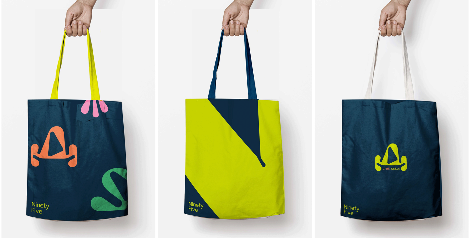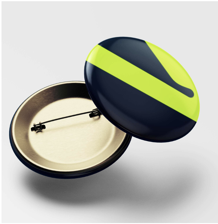
This project was a live brief with Christchurch’s New science museum which will be based in Devon. The new identity required a logo, colour palette and new visual language. The project was ‘highly commended’ by the client and was ‘one of the most professional and refined identities’.
The Ninety Five
The ninety five was developed in collaboration with fellow student Joe Cave, together we created a response to the live brief ‘Christchurch Science Museum’. For this project we achieved ‘highly commended’ by the museum.
We designed the Ninety Five, a contemporary, colourful logo that incorporated the form of water.
Brand identity.
The brand we created focused around the name the ‘Ninety five’. This name is based upon the fact that only 5% of the sea has been explored which is in keeping with the museum’s brand proposition: discovery.
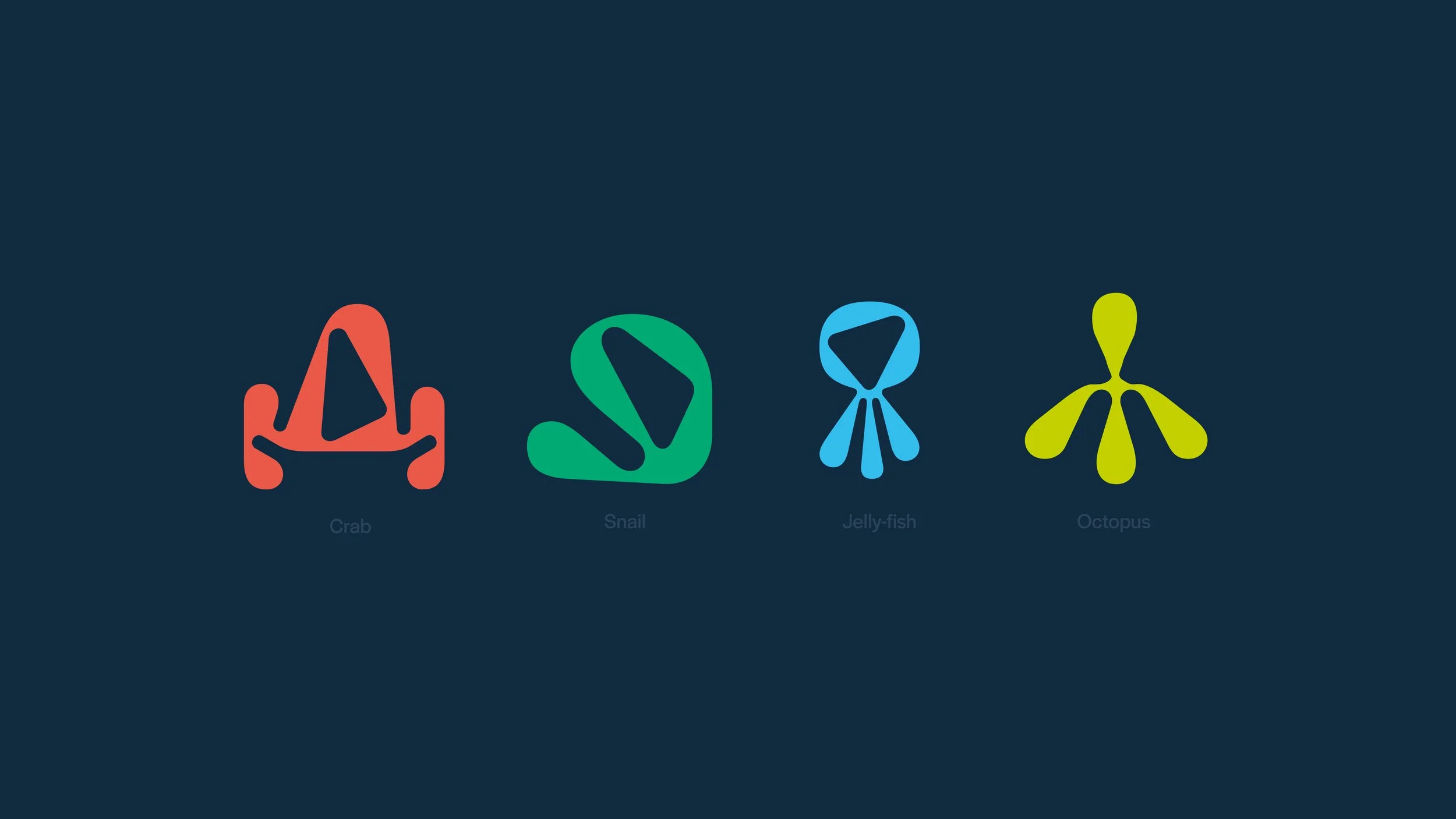
The brand uses two primary colours which heighten the premise of exploring deep underwater. Ninety five also has multiple symbols and secondary colours reflecting the new target audience: young children.


Brand in context
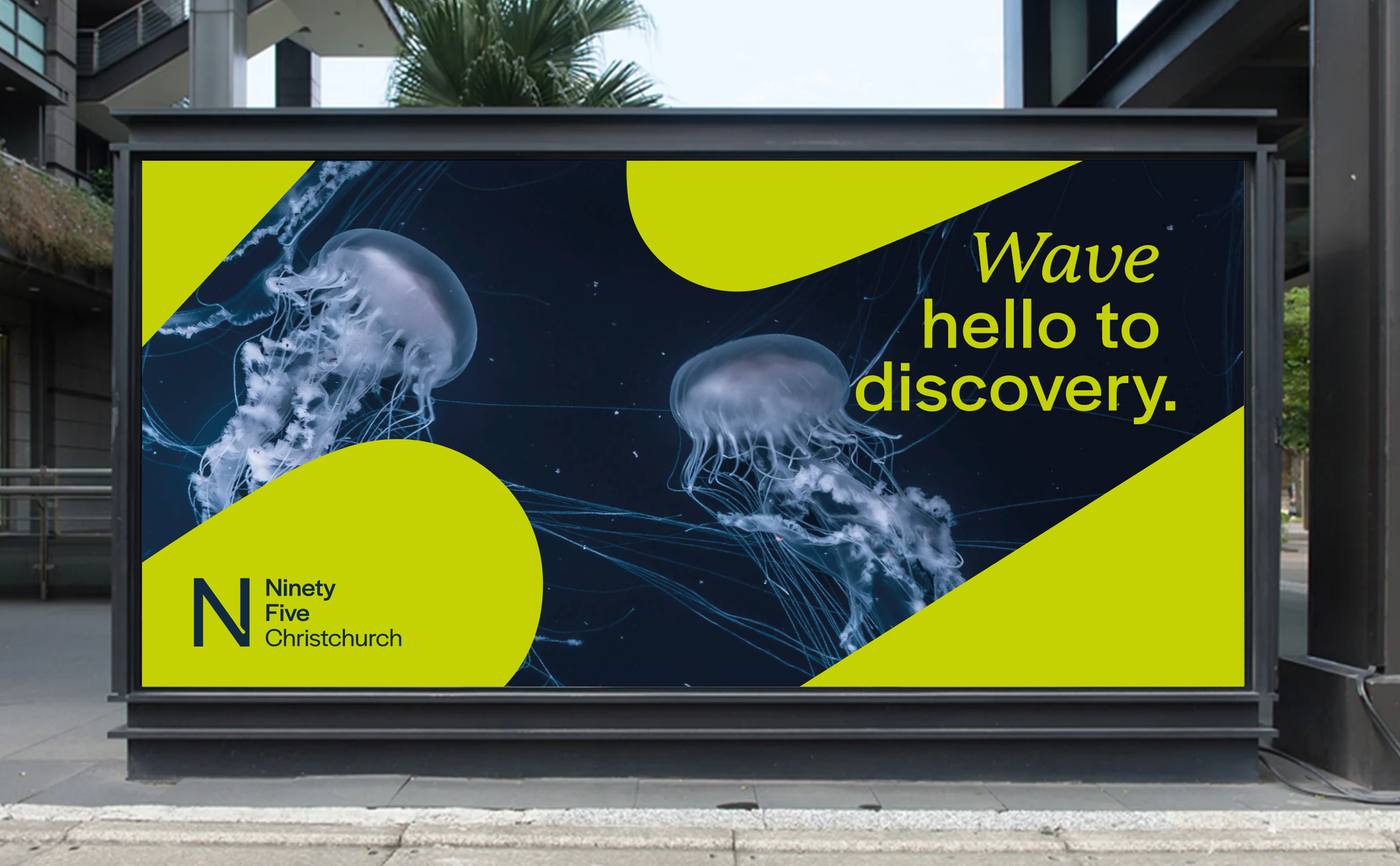
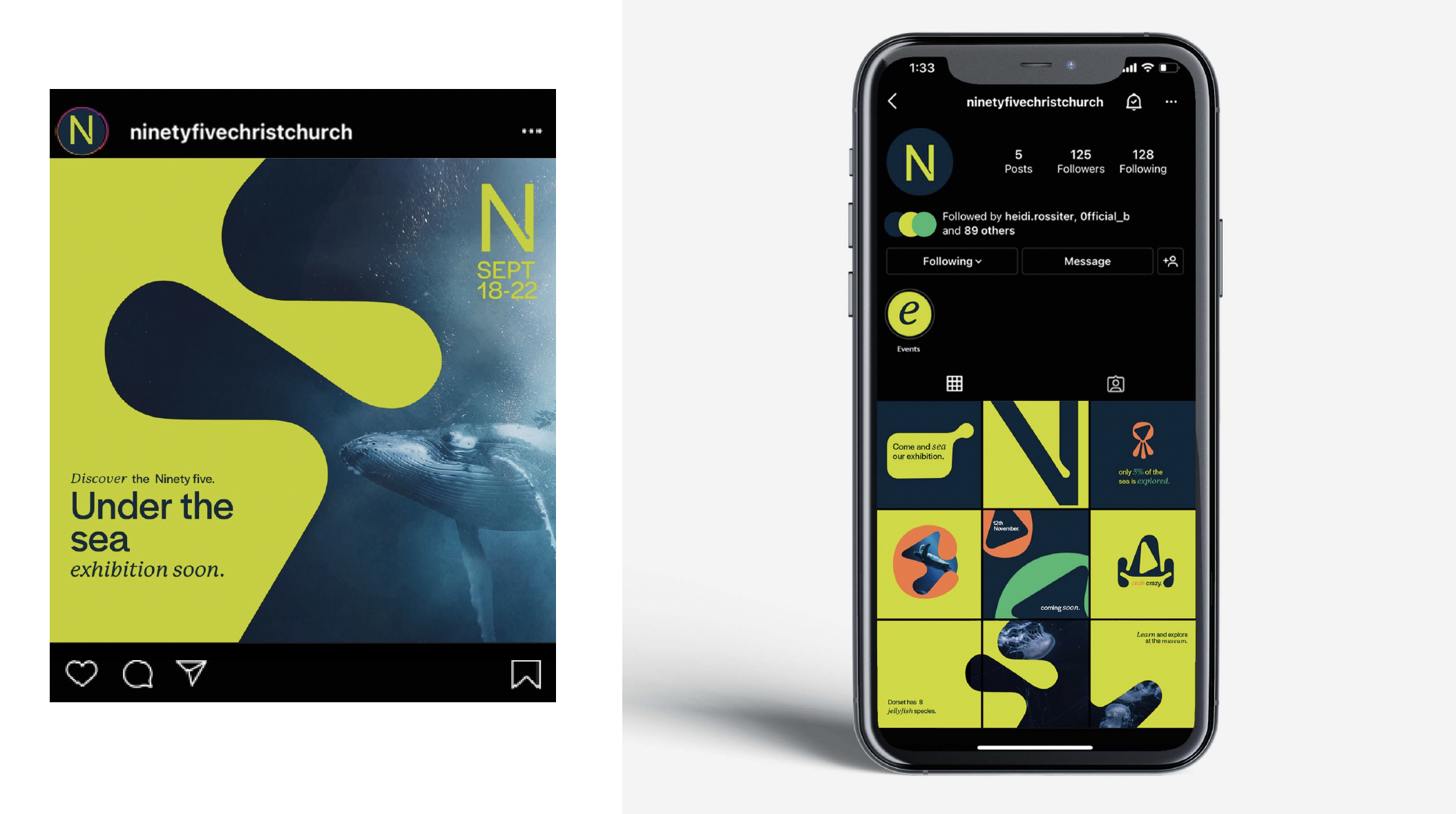
This is how the brand works across multiple touch-points. The logo is used as a framing device within the imagery with it’s form signifying a water droplet.
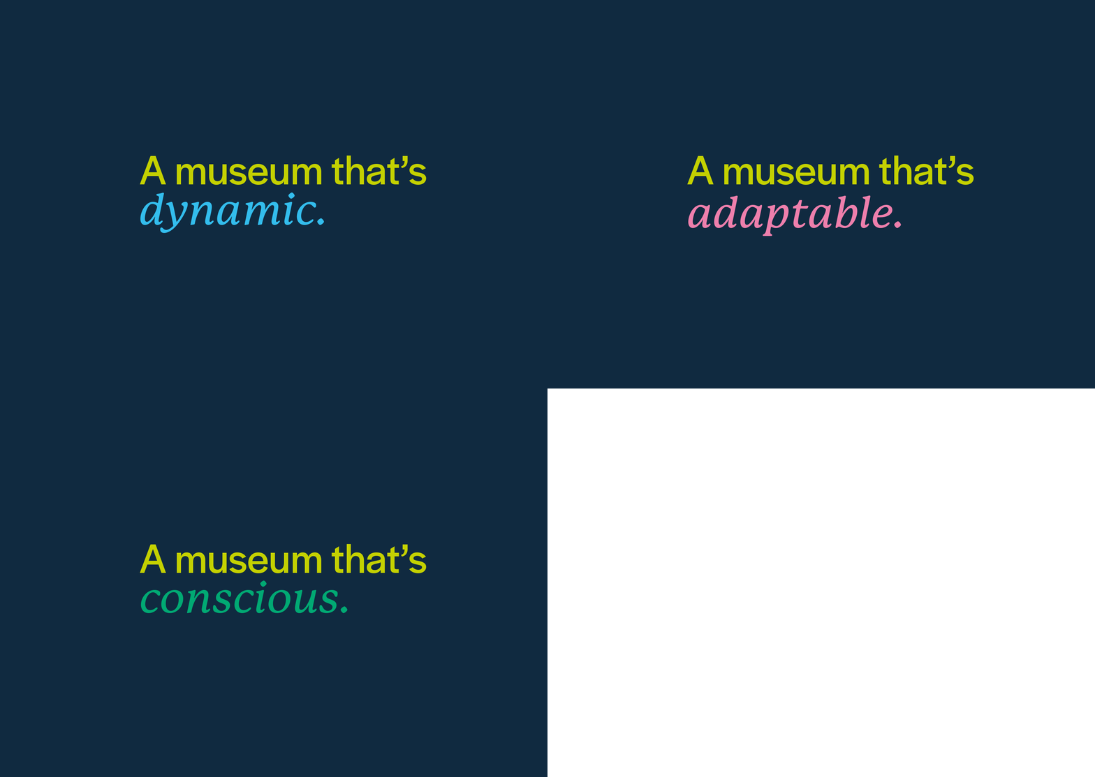
Furthermore the secondary italic font is used to highlight key words.


Way-finding
As part of the way finding we designed our own set of icons in keeping with the logo’s form. This included a female, male, disabled and directional arrow.
Furthermore, we used our colour coding to help differentiate between sites within the museum.
The Uniform
The uniform is designed upon aprons so that the individual can wear their choice of clothing underneath. Each apron comes with a contrasting strap in the colour palette of the museum using the block colours.
“A museum built upon the discovery of what lies beneath”
— The Ninety Five Museum
