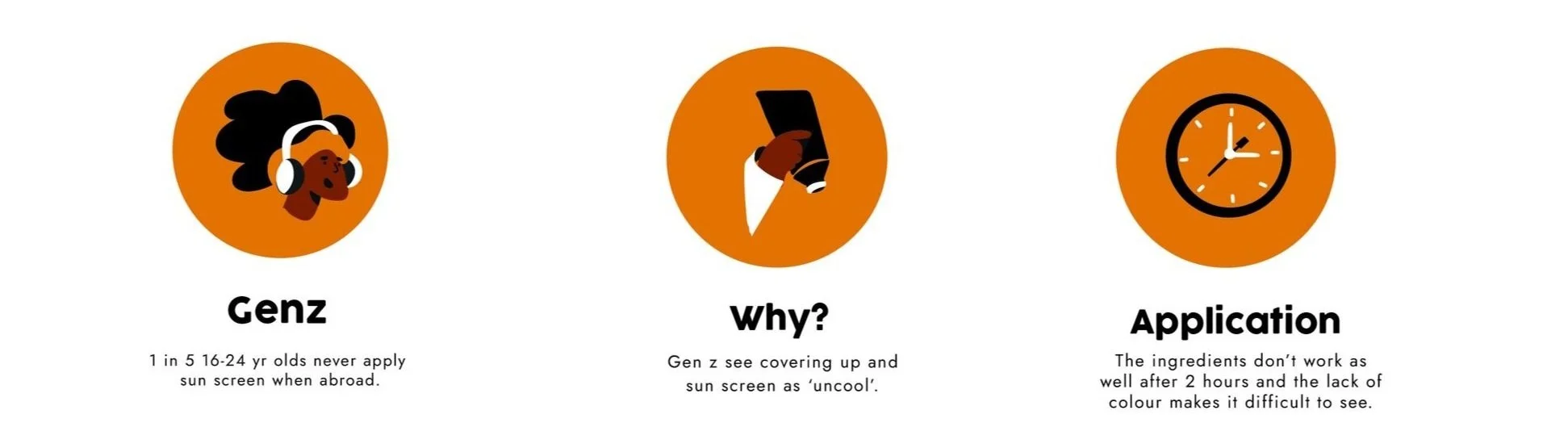
I undertook the Opening Up brief as part of the Dragon Rouge fire starter awards. The brief required adapting a current product to a new audience. I chose sun lotion.
Shade
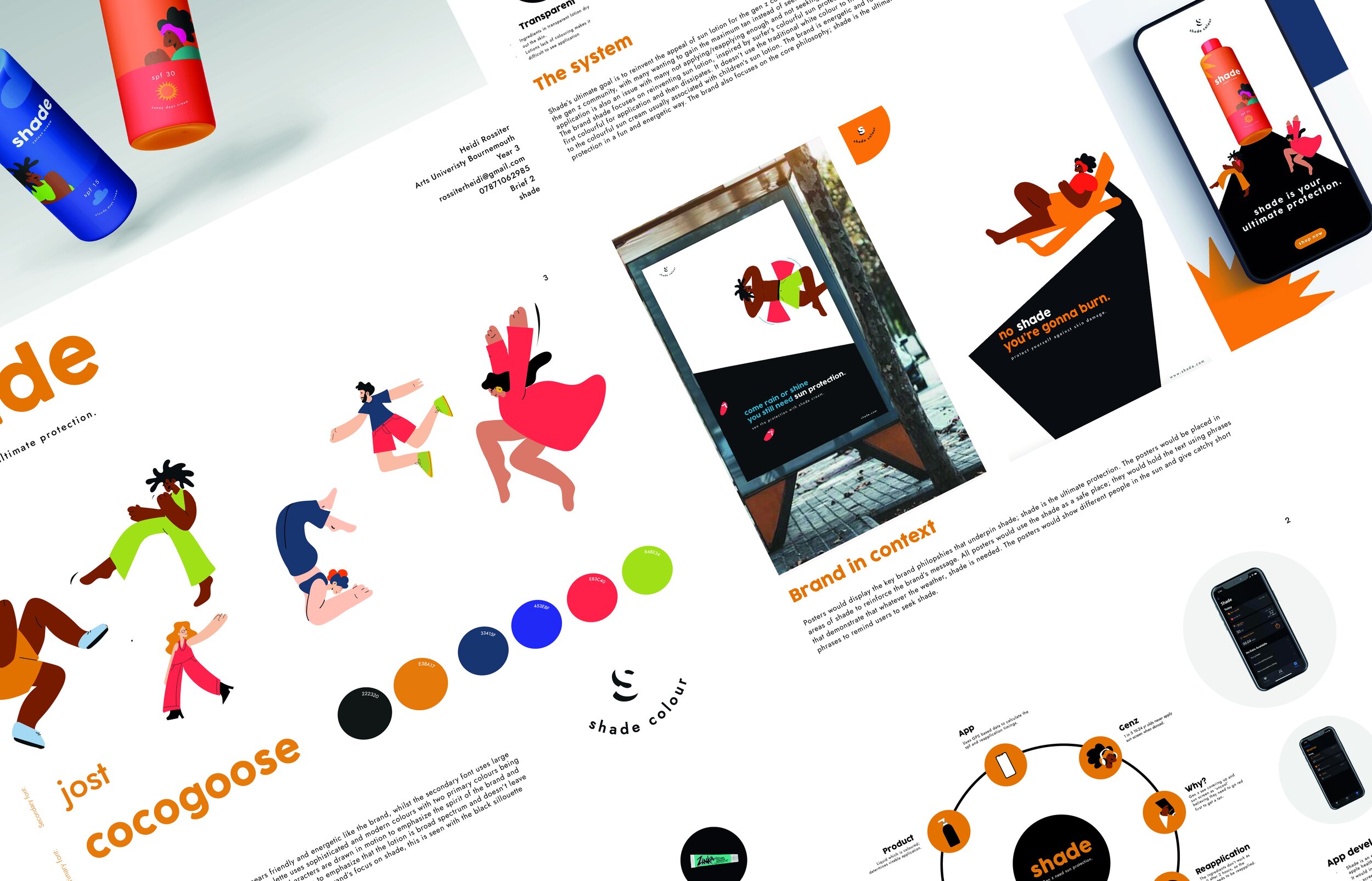
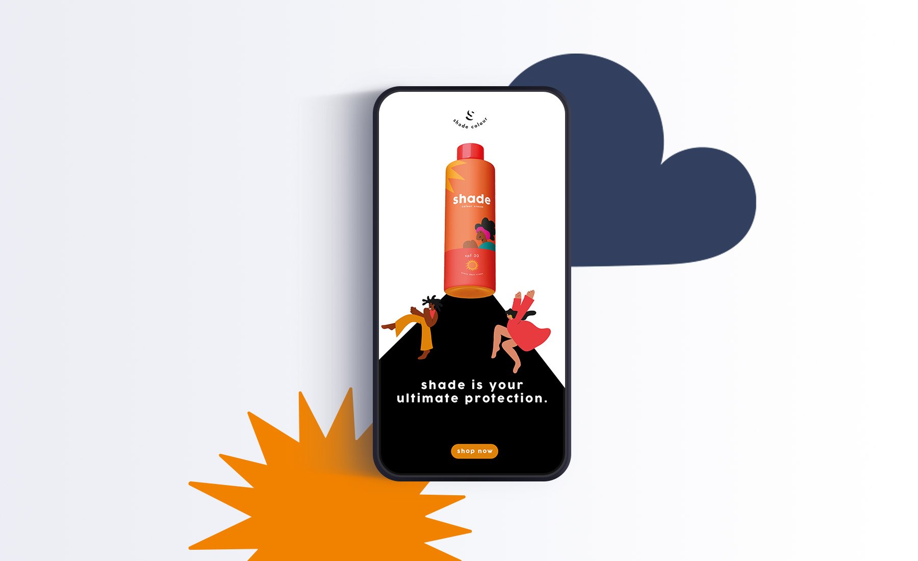
Shade is a brand created to reinvent the appeal of sun lotion for the gen z community; inspired by surfer’s colourful sun protection, shade’s lotion is at first colourful for application and then later dissipates when rubbed into the skin.
It uses bright colours and bold packaging as well as an app to help consumers regulate UV rays and their application of sun lotion in order to prevent sun damage.

Logo
The brand logo uses the negative space of the letter ‘s’ to represent Shade. This helps emphasise the ultimate protection is shade.
The text forms a circular shape to reflect a sun.
Brand identity
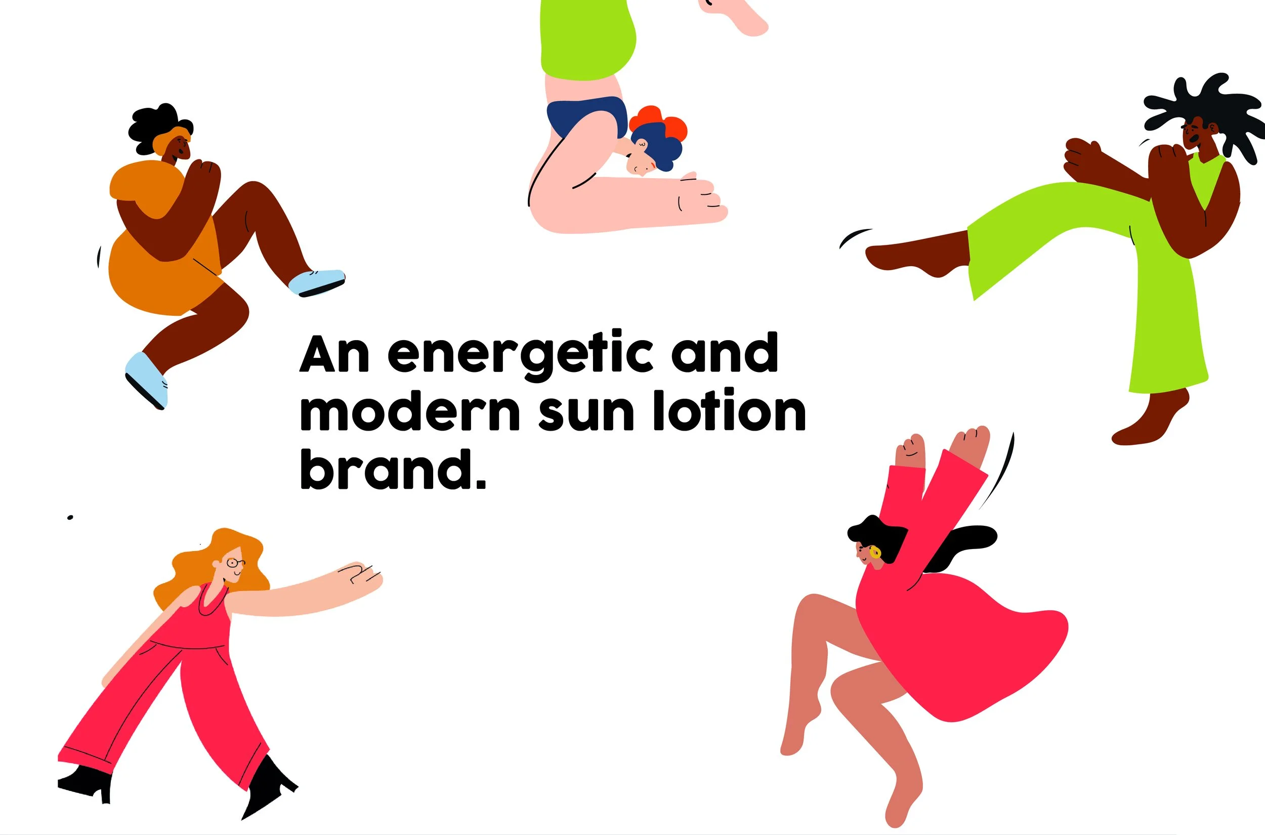
The brand uses an illustrative style to bring character to the brand and emphasise that every skin shade requires a different spf and strength for optimum protection.
The illustrations represent different ethnicities to show that the lotion is broad spectrum and doesn’t leave a white cast like other sun lotions.
The illustrations further reinforce the brand’s USP, each character wears different colours and is bright and bold in their position and action. This reflects the theme of colourful sun lotion.
Brand touchpoints
To emphasise that shade is the ultimate protection I ensured adverts were placed in shaded areas.
Each advert also used the area of shadow as a text box.


Process boards
I created the brand ‘shade’ as part of the Dragon Rouge Opening up brief. This brief required you to think outside of the box and open up an existing product to a new target audience.
In line with the entry requirements I created four display boards which highlight the brand and it’s philosophies.